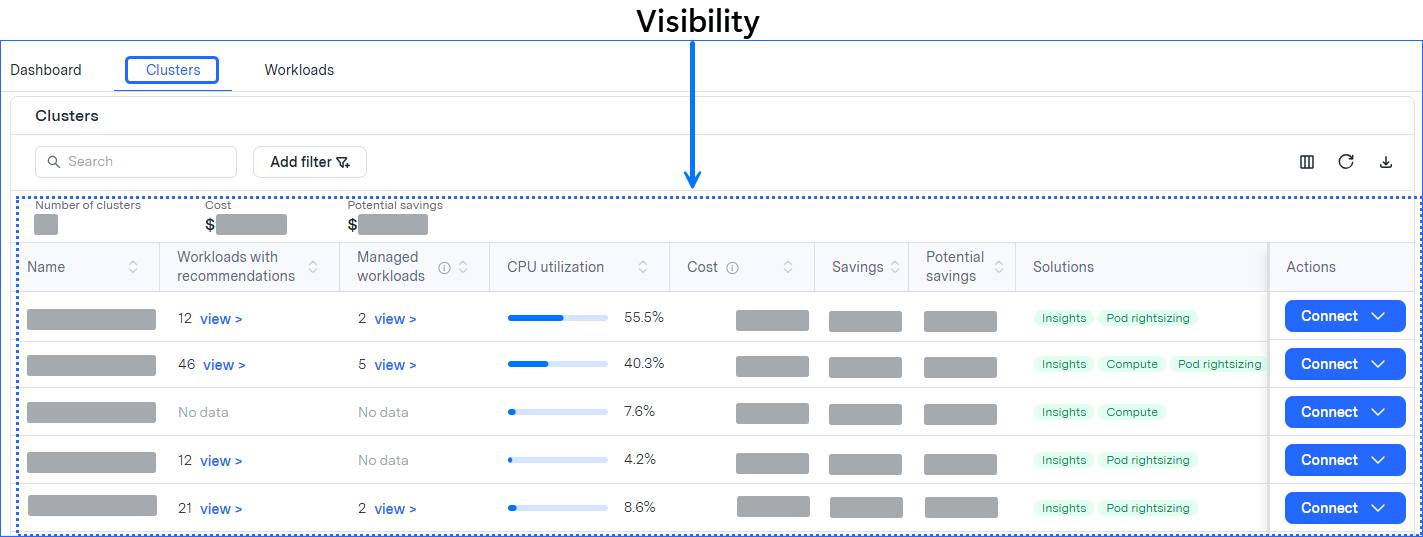
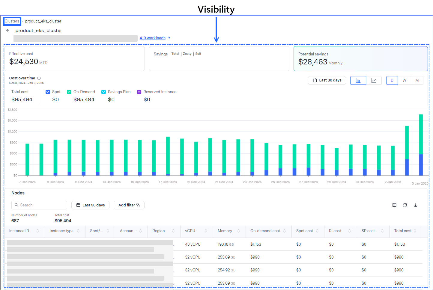
You can benefit from Kompass visibility from the Dashboard tab, the Clusters tab (and the drilldown), and the Workloads tab.
The following table lists the visibility you can see in the Kompass interface:
To see this metric | See this part of the user interface |
|---|---|
Cost KPI and utilization graphs | The Dashboard tab |
Cost and utilization on the cluster level | The Clusters tab |
Cost trends per type and cost on the node level | The cluster drilldown |
Cost and utilization on the workload level | The Workloads page |
The Dashboard tab shows cost KPI and utilization graphs:
.png)
The Clusters tab shows cost and utilization on the cluster level:

The cluster drilldown shows cost trends per type as well as granular cost on the node level:

The Workloads tab shows cost and utilization on the workload level:
.png)